Fighting With the HUD
Author: Tyler Clardy
Date Posted: 5/15/2024
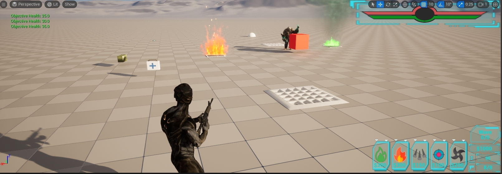
One of my main tasks for this week's sprint was to overhaul our player HUD. I was looking forward to this for a while, especially as it tied in with my other main goal for the week, overhauling the 'Place Trap' ability to include all the new traps. So I spent some time tracking down nice assets and then got to work.
To start out with I created a series of new widgets to fill in some functionality our prototype HUD was missing, and then began to use my new assets to make both old and new HUD widgets look good. At this point, much of it was nonfunctional but it looked pretty and was a great place to start.
From here I set about making the trap selector functional. I tried a few different approaches to this and ultimately settled for a simple, but tedious, solution. I set some new input bindings for 'Select Left' and 'Select Right,' and then defined custom logic for them in the player blueprint. Using the player's existing reference to the HUD master widget that holds all the smaller widgets I was able to manipulate the visibility of the white selector arrows above the traps in the HUD. The logic for this was repetitive and ballooned to a large size, but ultimately worked beautifully. 
Finally, I looked into getting the new Health and Stamina bars working. I'd assumed this would be as simple as slapping the same prototype logic onto the new progress bar widgets, but that, sadly, did not turn out to be the case. I had a consistent issue with the bars ranges being larger than they seemed visually. This is somewhat hard to describe, so I created a video here. The problem is immediately apparent as I begin sprinting and then taking damage. The under-the-hood values for Health and Stamina do not match the visual indicators on the new HUD.
So I set about the long process of trying to work out just what exactly was going wrong! I watched YouTube videos, browsed old posts on the Unreal forums, read the documentation for various nodes and components I was using, and even reached out to peers and mentors in the industry. I got nowhere. Feeling frustrated, I put this bug on the back burner for a few days while I accomplished other tasks.
When the time came to come back around to it, I settled in for what I was sure would be a long and annoying day. While it did end up taking many hours, I eventually found the problem. The progress bars I had set up were operating in a range of 0.5 to 1.0, while most progress bars normally operate from 0 to 1. This was due to the way I had them split and draining towards the center. Upon realizing this I was able to introduce some clamping and range conversions to my updating of them and BOOM! They worked!!
I'm very pleased with the end result of my HUD overhaul. I'm looking forward to soon finalizing the last pieces needed - mainly making the Wave Counter functional and adding the Ability Cooldown counter to the blank circle bit in the middle of the Health and Stamina bars. These will be coming soon!
Get Dimension Defender
Dimension Defender
| Status | Released |
| Authors | 2bitStudio, GwilymHernandez, Tclards |
| Genre | Shooter |
| Tags | 3D, Fast-Paced, High Score, Sci-fi, Singleplayer, Tactical, Third-Person Shooter, Tower Defense, Unreal Engine |
More posts
- Balance Patch and QA!Jul 23, 2024
- Expanding Tokyo City!Jul 05, 2024
- Overhauling the Trap PlacementJun 17, 2024
- Overhauling the Shoot Mechanics Pt. 2Jun 13, 2024
- Overhauling the Shoot MechanicsJun 11, 2024
- Damage & Health VisualizationsJun 06, 2024
- Getting in to Alpha!May 30, 2024
- From Code To BlueprintsMay 30, 2024
- Enemy AI UpdatesMay 25, 2024
- Working on Design TasksMay 24, 2024
Leave a comment
Log in with itch.io to leave a comment.